Tuesday, 28 October 2014

Digipak Ideas

24/10/14

Katy Perry's 'Teenage Dream' digipak has inspired me and given me ideas for when creating my own digipak. I really like the camera shots she has included,  the typography used and the way she has made it consistent to her album songs.

When i create my digipak i will follow some of her ideas but will adapt on them. As my front cover i will have a close-up of the artist, instead of a wide-shot, so that it's conventional to the pop genre. On the back cover there will be a trackless on the left side and a long shot of the artist on the right side. The inside of the digipak will be similar to Katy Perry's of having similar cinematography, however the cd i would like it to be simple by just having a plain coloured background with typography that needs to be included on it. I will also make sure that my digipak is consistent to the song 'Battlefield' by going with the colour scheme of black and white. My digipak will consist of two CD disks and a lyrics book to make the audience feel as if they are a part in the songs. 


As the group and i have decided to take some photographs of the artist at Notting Hill, my ideas of creating a black and white digipak may change. I think its important for the digipaks to be conventional and amplify the pop genre really well so that the targeted audience are aimed on point, therefore the idea of a black and white digipak wouldn't work too well. I think by capturing some shots at Notting Hill with the costumes on the artist being quite bright or girly will convey the pop genre really well. 


I will experiment firstly, designing my digipak based around the colour scheme black and white; so that it is consistent to the album. However if that doesn't work well with the pop genre i will develope my digipak into making it a bit bright by using pastel colours along with brighter images but will make it consistent to the album by including images of a ballet dancer.

Wednesday, 22 October 2014

Post modernism & our music video

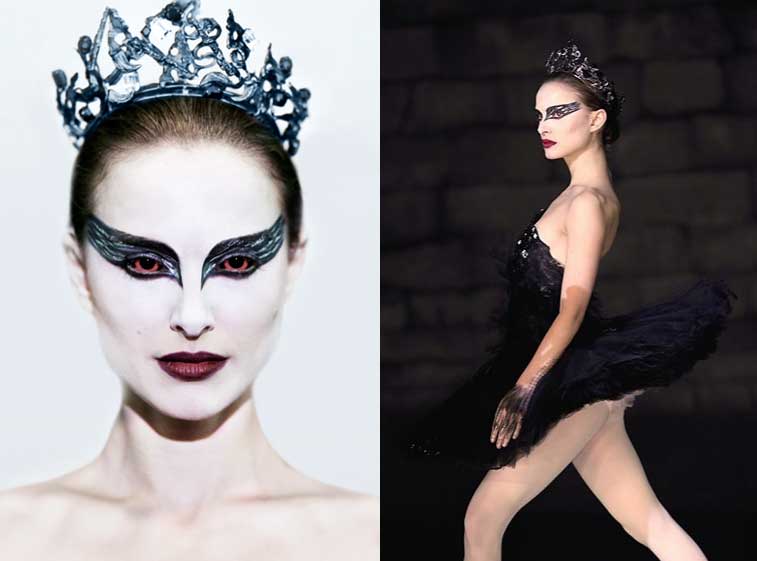
Post modernism will be presented in our music video as we have used 'Black Swan', which is an independent film, to influence us into filming. The ballet scenes, which will be part of our music video, will be highly inspired by the 'Last Dance Scene' in 'Black Swan'. The ideas of high key lighting will be taken as well as the concept of having a ballet dancer. Our music video will therefore show post modernism as we are taking ideas from an experimental film and making it mainstream by having it shown in a mainstream genre of music; Pop. With the artist we have created, our music video will be viewed by a mass audience making it mainstream and ''normal''.


Planning our pitch

22/10/14
As Megan and Aaron were completing their blogs, Hayley and i started to construct a rough draft of our pitch in which we will develop and construct fully once Megan and Aaron have done their parts. The pitch that we are creating is to present, after the half term, to the whole class so that they have a vague idea on what we are doing or planning to do and so that we can get feedback in which we can improve areas on.


Teacher feedback


This is a short clip of the feedback i received from Mr Grimsley on my blog. The feedback i received i will take into consideration by going through my posts and altering them by adding things on and developing them. I will also link post modernism to our music video as he suggested to do so. This feedback was really helpful as it gave me a rough understanding of what i need to do in order to improve my posts. It also re assured me of what i am doing is right and i just need to carry on progressing.

Monday, 20 October 2014

Storyboard Planning

20/10/14
We began planning our storyboard for our music video. This is the major part during the production of our music video as from here, we will know what shots to take when and where. This storyboard will be a part of our pitch, in which we are building up as a group to present to the class after the halfterm. I was illustrating roughly each frame in our storyboard while Megan was re-playing the songs and listenting to the lyrics so that she could tell us all what each verse was about. Aaron and Hayely here were sharing there ideas of what shots to take.
The rough sketches i did of the different shots all connote a meaning by reflecting the characters emotions or the lyrics. We all agreed on keeping the idea of shooting the whole music video in black and white as we feel it amplifies the whole concept. The music video will not be completely in monochrome as we will have some parts showing colours.


As the song begins with the introduction of instrumental we will take a wide shot of the ballet dancer on the floor with her back to the camera. The camera will then later on pan round to her face which will lead to a close-up. This pan movement we do will be crossing the line disorientating the viewer and making the scene odd reflecting the characters feelings and emotions. There will then be a cutaway of the artist Isabel Beau singing. This resonates on one of Goodwin's convention as the demands of the record label will be fulfilled by the artist being shown and presented to the audience initially being advertised.


We will experiment with shooting hand-held and using a tripod so that we know where its best to use these techniques when filming. There will also be a range of shots taken so that when it comes down to editing we have lots of clips to choose from.

Throughout our music video there will be a range of cuts between the scenes of the narrative and the artist. This music video will tell the narrative of the bad times, in her family, the artist has been through and how she overcame this rough time. The music video will consist of a lot of short takes and close-ups to make the video snappy and interesting and to show the emotions of the character. 

Friday, 17 October 2014

Production Log for Test Shoot

17/10/14
In order to be able to take photos for our digipak, we had to create a production plan listing the location we want to take photos in, the actor that we will take photos of and the costume needed along with a checklist. The photos that we will take next week will be based around school due to us testing areas like camera handling, lighting and costume styling. The photos we will be taking for the first few weeks will just be taster ones in which we will develop by reshooting and improving.

Location:


The location we have decided upon, for taking our photos for our digipak, is the drama room in school. This is because we feel that we can really play around with the low key lighting and high contrasting areas. We felt that the best time to use the drama room would be after school as at this time there will be no school kids around and the room would be free.

The second location we looked at was the art gallery in school. As the gallery is white and has the bright natural lighting, we feel that is will give that photo-shoot feel we want to express. Having a plain background allows us to edit any areas of the photos on Photoshop. I think taking the photos of the artists in a photo-shoot context will give a greater impact as the primary focus will be her amplifying the pop genre.


The third location we are thinking to take some photographs are at Danson park. There is a flower section in which we can use as a background and take photos of the artist. This location will be consistent to the digipak of having a floral section.


Actor:
Our main actor in these shots will be the artist(Isabel Beau) who will be a member from our group(Megan Harris). We felt that having Megan be the artist will be very convenient as whenever we need to shoot or take photographs she will be flexible and available; especially when it gets to the re-shooting stage.


Costumes:

We are yet unsure of the costume that we will use. Therefore Megan will take photos of outfits, which she feels fits the artist and genre of music, and send it to us via WhatsApp so that we get a vague idea of what we want the costume styling to be like. 
                                                          

Checklist:
Pink River Island Bag
Make-up artist
DSLR camera
Tripod
Costumes(dresses, heels, shoes)


Focus Group- Production Log

17/10/14
In this recording we are discussing the production log of where we will shoot, what costumes we will use, who the actress will be and a brief checklist. This production log that we have planned will be a rough idea on the rough shots that we will take. The photos that we will take using this production log will just be a taster so we get a vague idea on what we need to do to improve.

Wednesday, 15 October 2014

Music videos that are inspirational

15/10/14
As our music video is about a ballet dancer we chose to look into the 'Last dance scene' from the film Black Swan. I felt that this scene from Black Swan was extremely useful as it created an image in our minds of what we want some of the scenes in our music video to be like. The songs 'Broken Arrow' and 'Gravity' by Pixie Lott is inspirational as it links really well with our concept and the style in which we want to create our music video. While watching these videos we made a few notes around the four macro elements expressed; the way the camera angles and lighting has been positioned as well as the setting used. We did this so that when it comes to constructing our storyboards we know what to sketch.


I really like the idea, from Black Swan, of having the ballet dancing in the centre of the frame with the surrounding being dark and a spotlight shining on the dancer. I think it creates a greater impact as the limelight is on the main dancer and gives that professional feel. It also creates some kind of interaction and relation between the viewer and the dancer as the dancer is expressing her feeling and emotions. The background being dark will connote the dark and down side of her life while her being dressed in light colours will represent her being pure and innocent.


Monday, 13 October 2014

Typography of Artist Name

13/10/14
To add on to our moodboard we all decided to select a font type for our artists name. We all went onto Dafont.com and started to research some font styles we could consider using. 
                             

We selected the best fonts, in which we found that went with our artist profile and pop genre well, and downloaded them onto one desktop. We then created a questionnaire on which font they preferred. The questionnaire was handed out to around 15 people between the ages of 16 and 25; this related roughly to our target audience. The results being recorded in a tally chart was really useful as it made it easier for us to see which font style had the most marks.

The feedback we got from the font selection, from mostly everyone, that the fonts were not suitable to our pop genre or the artist. People felt that the spelling of the name Izabel Beau with a 'z' did not work quite well with the whole pop genre so we all then decided to change the spelling to 'Isabel Beau'. Sinead suggested to us into looking at 'handwriting' fonts rather than 'Valentine' as valentine looks a bit childish due to the love hearts.
                                                       

We then decided to research and select fonts from the 'Handwritten' section of which we felt worked well. I think choosing the hand written style fonts looked much better than the previous fonts we selected as these gave more of a personal touch due to the name written in a style of an autograph. The hand written fonts attract the audience by connecting to them and making the album personal. This links in well with our theme of the album/digipak being based around the artists life and what she has been through.  Another questionnaire was then created replacing the original one.
                         
                  
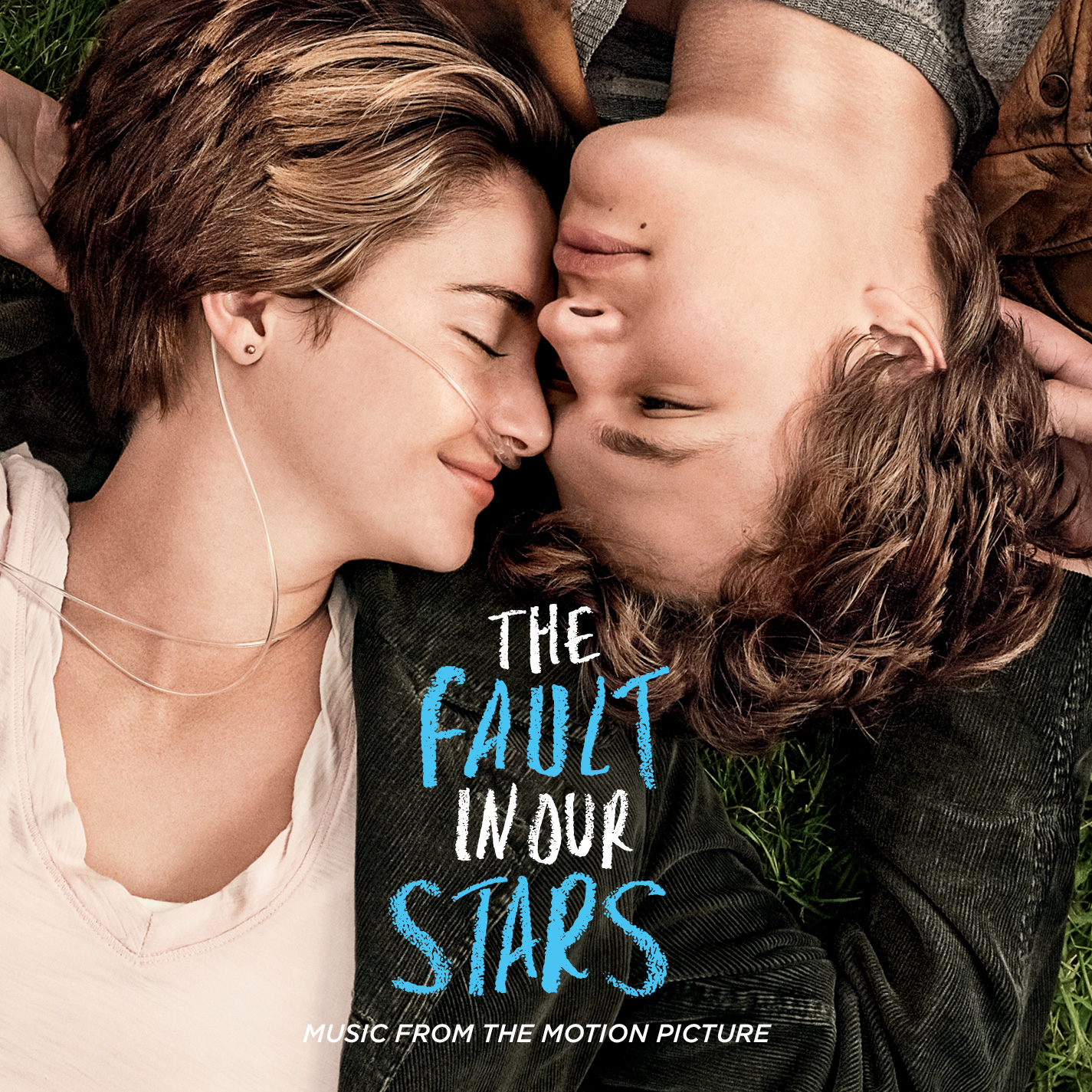
People felt these choices were more broad and suitable to our genre and artist. The results expressed to us that many people felt the first font type worked well. I think the first font works really well with our artist and pop genre as it reminds me of the way Taylor Swifts spells her name and she is one of the artists which inspires Isabel Beau. I did not like the second font style too much as it reminds me of the film 'The Fault in our Stars' which is not really related to our genre or style of music.

Friday, 10 October 2014

Codes and conventions of pop genre

Through researching and analysing many pop based music, I found quite a few conventions and characteristics that consisted in most of the songs. The artists(Pixie Lott, Ellie Goulding and Taylor Swift) in which we are mostly referencing to inspire our artist due their style portraying elegance and innocence. These artists are also fairly young which relates to our artist being nineteen which therefore mean that the target audience and style of songs will be like these artists.

The element of performance is important in pop music, whether it is dance routines being spontaneous or choreographed. The focus on pop music videos is of the artist dancing or the performance being shown in the background.


I have also noticed that the music videos in pop genre consist of fast editing and cuts due to the pace being fast. The style and fashion of the artist being portrayed is also important due to it reflecting to the audience the type of person they are. If the artist is portraying the current trends and colourful high fashionable clothes they are more likely to attract their target audience. 


I find that in many music videos, the pop genre focus more on visuals than narrative therefore meaning that we are contradicting the conventions of pop as our music video is entirely based on a narrative as well as visuals. The visuals in many pop genre music videos being entirely based on colours and fashion is to attract the young female and be purely to appeal to them.

The characteristics in which me must include or consider including are Goodwin's theory of music videos. Having constant close-ups of the artists so that the artist is being advertised well will be the main point, referencing the notion of looking and having a good relationship between the lyrics and/or music and visuals.

Moodboard

06/10/14
Today in our group we all individually researched images that we can all put together and in-cooperate in our mood-board; a mood-board is a visual presentation of a brainstorm. I think they're useful as you get a visual vague idea of what your artist will look like or what the music video will be like. We collected images that described our artist and went with our music video.
                       

We then began constructing a mood board by cutting and placing our images on a A2 black sugar paper. Our artist being a female solo pop singer of a alternative pop genre will illustrate the idea of fashion, colours and beauty in our mood-board. As our song and music video is to do with the concept of dance we in cooperated a lot of ballet photos. We included hair and make-up photos so that we express the high fashion female pop artist. There is a floral background, in our mood board, to illustrate that our digipak or accessories on the artist will consist of floral elements. The floral background that we presented is the same images that a group last year used in the pop genre moodpboard. This therefore suggests to me that the pop genre of having floral is consistent. Showing shots of a ballet theatre is the setting we may consist or will try to in our music video.

Digipak planning

10/10/14
We began planning our digipak, as a group, roughly in what style we will create it and what it will consist of in each panel. We did a rough sketch of or digipak in the middle and did a vague mood board of pictures that inspire us. Pixie Lott was the artist in which her albums inspired us the most. Her artwork is the style we are planning to go for; the colours and shots she uses are really inspirational.
                             
                             
Due to us all having a different ideas on what we want each panel to look like, in addition to the group digipak planning, we created an individual digipak planning. I sketched out in detail a rough plan on what I would like my digipak to look like. I sketched out the artist and a rough design on what I want on each panel. I labelled around the digipak so that when I look back at this plan I know what I am looking to do and consist on each part.

I think by using imagery and different colours, on both the digipak planning, really helped and gave me a rough idea on what my digipak will be like. The vibrant colours, of mostly pink, is to connote the genre of pop and illustrate that girly feel. The rough digipak planning being hand drawn gives a very nice touch; especially the scribbles of different colours reflecting the pop genre and showing consistency. 

Tuesday, 7 October 2014

Final Artist Profile

               
This track list that we came up with are all a mix and match of tracks from existing artists. The sample lyrics book that we will create will be from these tracks that already exist.

The album name 'Uncovered' came to our minds as it amplifies the message of this album being all about the artists life and the reality of her; that not many people know about. I think this name works really well as it appeals to the audience, especially her fans, of them feeling the need to consume the album due to it being based around the reality of her that no one really knows about. The title leaves a mysterious feeling towards the audience on what the album will be like and what the artist has been through as it is personal.

We chose the name 'Izabel Beau' for our pop artist as we felt that it worked well suiting the type of person she is; singer, dancer, plays piano and down to earth. It is also very unique from all the other alternative pop artists which makes her stand out to the audience. Izabel Beau is a very elegant soft name which describes the artist well and portrays to the audience the type of artist she is.

Friday, 3 October 2014

Artist profile 1

03/10/14
Name: Izabel Beau
Age:19
Music genre: Pop
Influence: Pixie Lott, Ellie Goulding, Taylor Swift
Style: Modern fashion
Physical appearance: Girly, sweet looking
Album title: -------
Track listing:------
Sample lyrics:-----
Artwork:-----------


Brief Biography:

Our pop artist is from London. She has a strong passion and interest in music which inspired her in becoming a pop singer. Her talents and interests are of singing and dancing as well as playing instruments like piano. Her family background is that she is lives with her mum and two sisters. Her relationship status is that she is currently single but was in a long-term relationship with someone but he cheated on her. Her school life is that she is completed all her education and is a very cleaver talented girl. Through her school life she use to get bullied for being different from everyone as she liked to be on her won creating song lyrics. This album, that we will create, will all be about her emotions and feeling of what she has been through; being bullied at school along with being betrayed by her dad and love.

Thursday, 2 October 2014

Audience Profile

03/10/14
                       
This is the audience profile presentation my group and I created for the pitch we have to do next week. We discussed the target audience and the artists in which our artist has been inspired by. We decided that we wanted our artists target audience to be teenage girls as our artist herself is a teenager which reflects on the idea of her audience being able to relate to her and her songs.To go with our presentation we also created a hand out for everyone to look at and read when we are doing our presentation.

This is a brief audience profile which we created as a handout for people to look at while we go through our pitch. This is so that our classmates can refer to what we are talking about and keep them engaged.
As music videos are a way of marketing an artists and their single it is important to have a target audience and audience profile. This is so that we know what type of people we are trying to appeal our artist to. Originally we planned our target audience to be between 15-25 however we felt that starting from fifteen limited our audience.

Wednesday, 1 October 2014

Song Choices

We thought again about using the song by Shontelle, T-shirt and felt that it was bait too slow and hard to think of the visuals due the lyrics being a bit too simple and boring; not having a narrative. So we researched into three song choices, including T-shirt and comparing it with the other two so that we can select the best one in which we will use in our music video. 

Our first song choice is 'T-shirt' by Shontelle

We feel that this song being slow pace will help us work with the visuals and will make it easier for us to create a narrative.


Our second song choice was 'Battlefield' by Jordin Sparks.

This song is really upbeat and amplifies a mixture of pop and RnB which also makes it easier for us to illustrate the visuals.

Our third song choice is 'Gravity' by Pixie Lott.


We feel that this song works really well with the concept of dance and amplifies the girl pop feel too. The colour theme in this music video being black and white gave us the idea of having our music being black and white to portray the emotional side of the narrative and make it more effective.
 From having a discussion, with the group, we decided that we wanted to go with the song 'Battlefield' as we feel that it goes along with the narrative well of the girl's parents arguing and love feeling "like a battlefield". Although it may be contrapuntal at parts of the music video due to the calm peaceful visuals of ballet dancing, we think that overall it will work really well and amplify the narrative as well as the pop genre feel due to the song being upbeat.

Ideas for Music Video

01/10/14
In our group ( Megan Harris, Aaron Pye, Hayley Boyle and me) we discussed possible ideas of our music video. We are planning on making our music video to be a narrative of a young ballet dancer. The narrative is of a young girl aspiring to be a ballet dancer and as she grows up she fulfils her dream. However through this progress she encounters problems with her family of her parents constantly arguing. The narrative will convey the message of the girl dancing to keep her away from family problems and will also express her feeling and emotions of feeling lonely and fed up of her parents always arguing.
The main macro feature we will focus on will be the cinematography of getting those camera angles right as well as the shots. We will take a lot of close ups of different parts of her feet, face and hands when the girl is dancing to show her body language and the emotions expressed. The visuals will show all the different ways in which the girl is struggling; shot of the girl sitting down on the side of the pavement waiting for her mum or dad to pick her up after a dance lesson. This will convey the message of her parents being so caught up in their arguments they are not showing love and time to her daughter. 

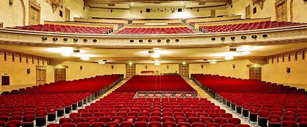
We began to think about the setting side of mise-en-scene in which we will film scenes at places like dance studio, girls bedroom, theatre and street. As we want to film elements in a professional ballet stage as well as a dance room. The theatre we researched that was nearby by was at Bob Hope Theatre which can be hired for free of charge.This theatre is perfect as it gives that big show feel and its nearby as it is based in Eltham which will mean that it will be easier for us all to travel there.
Map of bob hope theatre


However we are finding it a little bit difficult to get hold of this theatre as well as a mass audience to make the shot look like there is a moderate audience and give that show feel.  The other problem is that the theatre is only free to use on a unsay morning and we will need our teacher (Shaun Grimsley) to come with us as he knows the manager but the school will not allow him to come with us unless all our parents send an informed consent.  


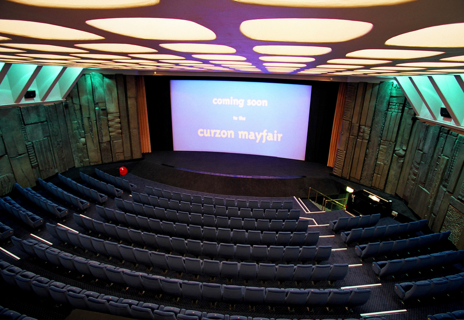
Therefore we decided to look in to Curzon Soho Cinema as our back-up if we don't get our first choice of the Bob Hope Theatre. The Curzon Soho Cinema doesn't look to bad as it still gives that stage feel and professional looking setting. Here we would only be able to film after closing times due to it being a cinema. The problem here will still be of finding enough people to be the audience to give the realistic show feel. Due to the cinema being up central London it will be difficult for us all to travel and get to the area.