Wednesday, 17 December 2014

First Screening

17/12/14
Megan had frees in the lesson's 1 and 2 which is why she decided on editing the cuts we got and constructing them together. The clips were converted into DV.files and then put in order along with our animatics so that the footage we have is clear. We then presented our shots that we took the classroom. 

The feedback we got was that the shots we took were minimal and all the same. We need to have much more shots and different ones with her in different styles. Shaun said this is mainly because we left the filming last minute and therefore didn't organise it properly. He also noted the idea of playing around with the colours black and white (negative spacing), having Poppy dressed in black and the background being white or Poppy being dressed in white with a black background. The black costume will connote the aggressive annoyed emotion of Isabel Beau relating to the lyrics. Sinead contributed in the feedback saying that she isn't too fond of the background as it looks slight tacky and maybe to film in the gallery next time as the background is more smooth and realistic. On the other hand, the positive feedback we got was that the lighting throughout the clips was really good and so was the costume she had on.


As we felt that our draft was really weak and we were all a bit annoyed with it we now know what to do next. We will film after the Christmas half term on the first week back so that everyone is available and start from fresh. We will also do the technique of filming each section filming with the whole song. So that we film Poppy singing the whole song and will choose the parts we feel work part of our music video. Also when we film the dancing we will do the same too. This therefore mean's that we won't fully go with the storyboard. We have titled and given roles to everyone in our group so that we all know our parts and concentrate on them really well, so that when it comes to playing each role it is done perfectly. My role will be to be Poppy's stylist which will be of pre-production. This includes making sure her hair, make-up and costume has the pop feel and is different in each shoot. In production Aarons role is to be the cinematographer while Hayley will be directing Poppy. Megan and Aarons role will be of editing the sequence during post-production.

Tuesday, 16 December 2014

Rough Music Shoot

16/12/14
Today was the first rough cut shooting day. As I had a doctors appointment I was not able to make it however we planned this shoot earlier on the day of what camera angles will be taken and where. The shoot was done of our artist singing her parts to 'Battlefield' according to what we planned in our storyboard. The shoot took place in our media classroom where the set up of the white screen and lighting along with the camera was done. Hayley was in charge of playing the music while Aaron was filming Poppy playing her part and doing movements that Megan's guiding her to do. The background being white and Poppy's colour being white looked really good expressing her innocence.

Many re-shoots were taken so that the camera angles, lighting and artist performance were all working along with each other in the right way. The performance of the artist, Isabel Beau, was impressive due to the aggressive and emotional facial expressions relating to the lyrics which follows the theory by Andrew Goodwin, of the visuals relating to the lyrics.

Monday, 15 December 2014

Final posters/digipaks

12/12/14
Flicking through the feedback sheets, i made notes on the areas i need to improve and change on in each format. I then began making these changes and improvements.I improved on this first poster by changing the typography wording so that the date is shown first in a short simple way. I also shifted the album title 'Uncovered' lower down so that it is more legible and bold.

                                                   
On this second poster I made changes by starting off with editing the image. I cloned the hair of our artist on the right hand side to make it look more thick and fuller; filling the gap. I then made the image of Isabel Beau bigger so that it covers majority of the page and made it be positioned more central and higher up; this is so that the audiences complete attention is on her rather then the type. I moved the small image of the album cover and the information to the left side so that it doesn't take over all the image. By adding the date on i made it clear to the audience of the release date of the album by positioning it under the album.

                                                   
I think both these posters work really well as they are consistent to the digipak. They both look professional and genuine however, I feel that the first poster looks much better as it look more consistent due to the same background and much more interesting. The way I have blended the paint background over the image and behind it makes it look captivating and beautiful.

The feedback i got on my digipak was that it's just right and perfect with expressing our artist personality and genre of music. This is of expressing Isabel Beau's personality being sweet innocent and girly as well as having an edgy seductive side but the album being about her life and personal and the situations she has been through. The lyrics book(fourth panel) and the way 'Isabel Beau' is written contributes to the album being personal and making it connect to the audiences. All the images work well together and link. Having the two Cd's, one being a bonus cd, makes this album catchy to the target audience as it is a unique selling point. The background and cd images work along with the images due to the pop girly style. I really like this final digipak that I have produced and it looks really professional and genuine.

Lyrics book

12/12/14
The fourth panel of my digipak will be a lyrics book. To make this idea clear, i made an example of  my lyrics book consisting of the songs and its lyrics. I made it consistent to my digipak and make a good understanding of it bing a part of it by having the digipak background throughout the lyric pages. I am including a lyrics book to make my digipak more personal and special to the fans or audience that consume my digipak. By having a lyrics book and encourages the audience to listen to the music and sing along with it by reading the lyrics.
                   

Sunday, 14 December 2014

Feedback on Posters and digipak

12/12/14
I presented me my developed digipaks and new poster designs to the class and Sinead and here is the feedbacks i got:
                  

Many people felt that the posters need to be further improved by changing the typography wording and the layout slightly. The front cover poster everyone really liked. They felt it was successful due to it being very creative and really good in that it is consistent to my digipak. However my second poster with the blue background needed a lot to improv on due to the typography not being placed and the composition of the image not being right. The digipak however, everyone felt was just right and doesn't need anymore improvements on.


The feedbacks i got were really useful as now i know what are the ares i need to change on the posters in order for it to look much more realistic and captivating.


Thursday, 11 December 2014

Poster examples

08/12/14
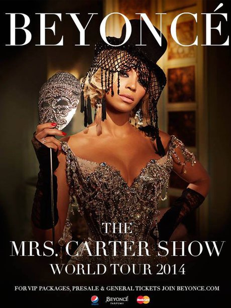
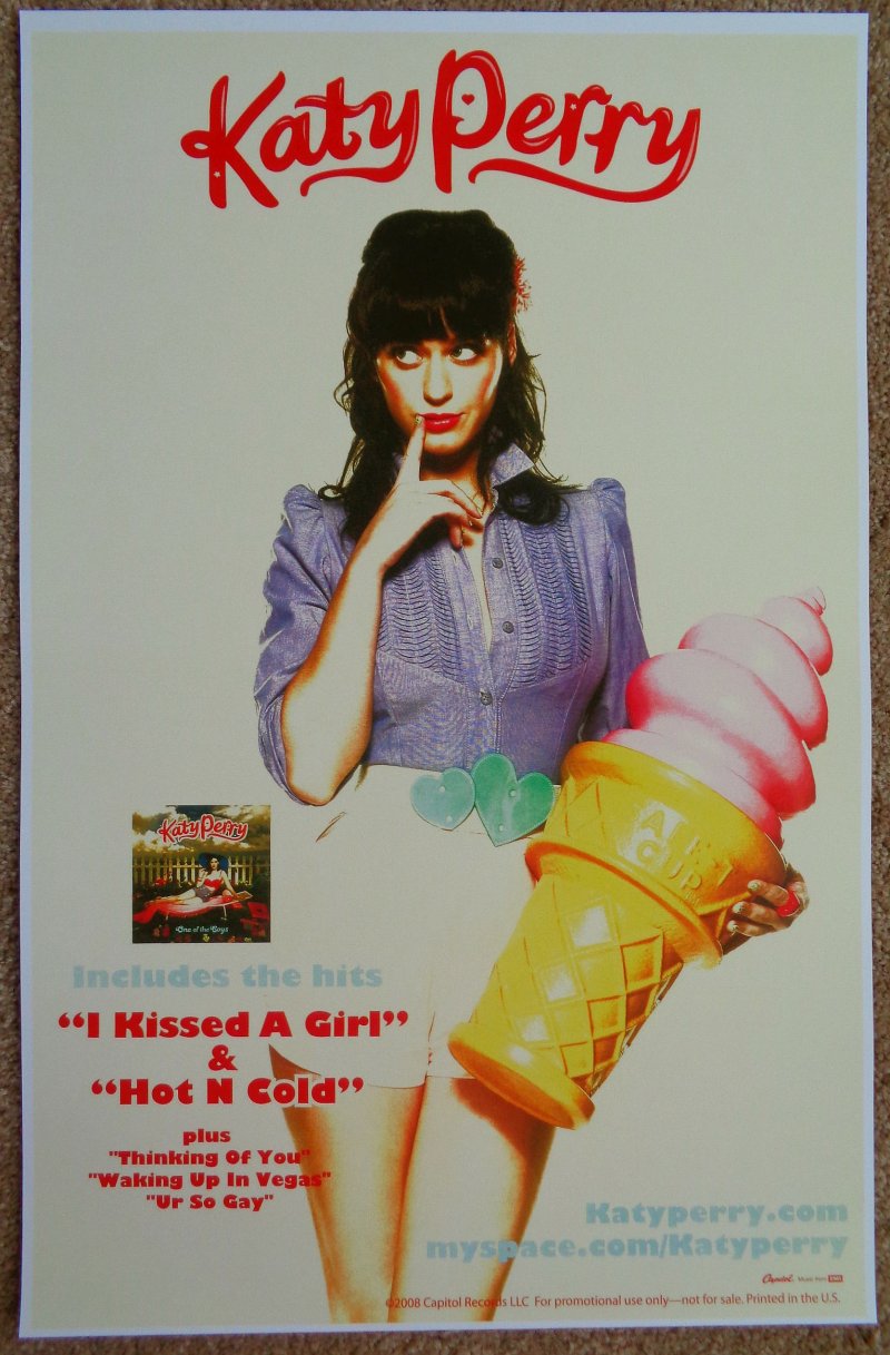
I decided to research into a wide range of posters as along with my digipak i have to create a poster. I collected secondary evidence of examples of pop posters so that I can have an understanding of what they all consist of and therefore what mine should consist of. I will also use these posters to influence me and inspire me into giving ideas to me when it comes to creating my own.

Wednesday, 10 December 2014

Poster2 Draft

10/12/14
I decided to create two posters as a final as I want to have two strong pieces in which I can hand in and achieve more marks. On the other poster I had the album front cover as the main image however here I have chosen to use the panel 3 image on the digipak and have the front cover image on the side. By designing two posters I am showing two images of Poppy which makes it more interesting as it shows the different sides to her; innocent sweet girl and edgy seductive.


Friday, 5 December 2014

Poster Designing

05/12/13
Today i started to further refine my digipak by adding the small details like copyright information and social media sites. I also changed the background in one image(pink stripy background) so it goes along with the blue stripy background which links well with the colours of both the cd's. On the fourth panel i changed Isabel Beau's clothes and make-up colour so that it looks different from the other images.

Along with my digipak, i started to design my poster. This is just a rough design so that i can show it to Sinead and get some feedback on how to change some areas as i quite figure out what to change. I think it looks okay however there is still an element which i feel is missing. I feel that the style doesn't quite work as it makes is a lot artificial but i will share this to the class and get some feedback.

Wednesday, 3 December 2014

Re-Pitch

03/12/14


I think that by doing this pitch again gave the audience(class and teachers) a clear idea on what our music video is based around and what we are trying to convey and express in the terms of the pop genre and narrative. As me and Hayley were not present to pitch along with Aaron and Megan, they did it on our behalf. We all created this pitch as a group and developed on it through the previous constructive criticism feedback we were given.

Tuesday, 2 December 2014

Developed Digipak

01/12/14
I refined my digipak by altering it slightly so that it looks well in shape and professional.  I took the feedback, that i was given from everyone, into consideration by changing parts of my digipak according to the suggestions that were made. By having 'Bonus Tracks' written on the second cd made it clear on what the cd is on. having the track list be in the centre gives a real clean classy back cover. Although the back cover is not conventional i think it still works as for example Katy Perry's 'Teenage Dream' back cover is just of a track list too. I altered Isabel Beau's face on the front cover by liquifying it so that it is altered and photoshopped connoting how ideal women look like and should look like.

Feedback on Digipaks

28/11/12
I presented my digipak to the whole class, explaining how i came upon this digipak and why I chose to use these colours, fonts and images.

The positive fedback I got on my digipak draft is that it has potential and that the front cover looks really good due to the close-up shot being well in focus, drawing the audience directly to her eyes. The colour scheme worked really well and connotes the pop genre beautifully along with the background and the images all relate to one and another expressing the pop artists personality. 

The improvements I was suggested was to make the artist name bigger than the album name, on the album spine, so that the artist name is more bold and well noticed. The font and colour of the album name doesn't fit well either so to develop on that along with the tracklist font style. Also to refine down the images so that Isabel Beau looks bright and clear. I want to edit the photos further and will by making it highly photoshopped to show the idea of perfection and to connote how women are portrayed in the society to be ideal. The image on the top right needs to be adjusted slightly so that it fits that panel well and to make the back cover more realistic and professional the tracts numbers need to be removed.

Feedback sheets: 


Monday, 1 December 2014

Animatics


03/12/14
As Megan and I had illustrated and planned the developed storyboard, we told Aaron to construct the animatic of it. He started off by taking close-up photographs of each frame, using a DSLR camera. When doing this he made sure that the lighting and angles of the frame taken in was the same and the shots were similar sizes. This is so that when it comes to putting all the shots together on Final Cut, the shots are smooth and consistent. Aaron constructed the animatic by uploading all the camera shots, on Final Cut Pro, putting them together along with synchronising with the music(Battlefield).

By creating an animatic, it gave a clear idea on what our narritave is of and how it reflects upon the music. This also shows Goodwin's theory clearly as it shows the relation between the lyrics and visuals as well as the link between the music and visuals. The animatic will be shown as part of our pitch so that this time our classmates and teacher have a clear view and idea on our music video narrative. 


The feedback we got from the animatics was that there was too many blank spaces left of what shots will be shown in some parts. I feel that our animatics didn't really flow smoothly as they're was lots of gaps. However there was a clear idea on the narrative just not on what shots will be taken. I think we struggled constructing our animatics because our storyboard was not strong enough. But i feel that we can use our storyboard as a starting point but when it comes to filming, take lots of shots using different camera angles and elaborating from the storyboard.

Re-Storyboarding

26/11/14
We began re-doing our storyboards so that they are more precise and are clear to understand. This is so that when it comes to constructing the animatics there is a clear idea of the narrative through the illustrated frames. I think this developed stroyboard is much better than the original as the illustration is much more simpler making it clear to understand. Comparing this storyboard to the original there is a high improvement due to the frames here being elaborated.  However it was really useful doing a draft storyboard plan as we used it as a guideline when creating the final ones. This storyboard is highly successful due to the narrative being expressed beautifully.